You could watch KPop Demon Hunters with the sound off—though you’d be depriving yourself of an Oscar-winning banger called “Golden”—and the colors alone would tell you a complete story. The film is a visual feast so meticulously crafted that every shade, every gradient, every iridescent shimmer carries narrative weight. The animation team didn’t just make pretty pictures; they built a visual language that reveals character arcs, emotional beats, and the entire thematic spine of the movie if you know where to look.
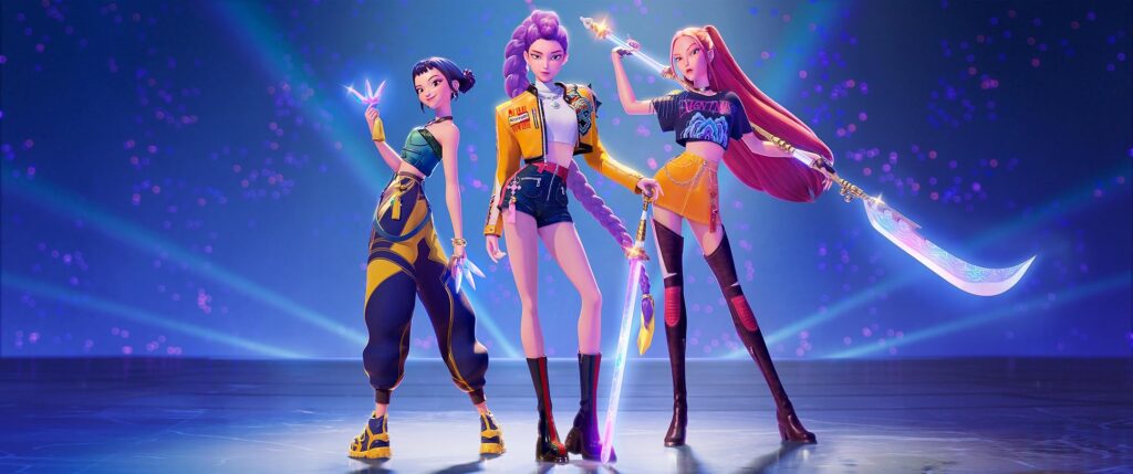
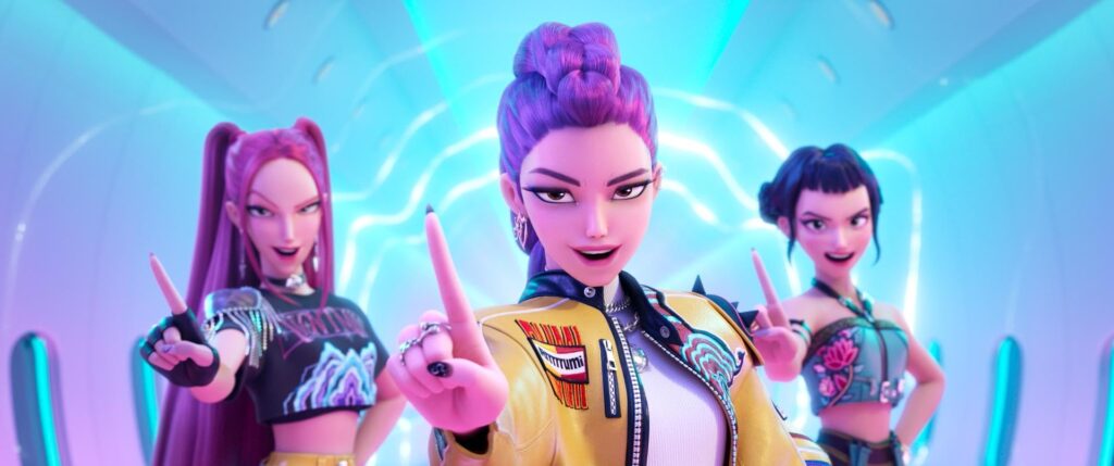
Directors Maggie Kang and Chris Appelhans established one rule early: no rigid color-coding. This wasn’t going to be Power Rangers, where each character gets assigned a primary color and stays in their lane. The HUNTR/X girls—Rumi, Mira, and Zoey—needed to reflect the complexity of actual people, not animated archetypes.
As production designer Mingjue Helen Chen explains, “She didn’t want to pigeonhole the girls into one personality.” The result is a spectrum of tertiary colors that defy expectation, sophisticated hues that carry the influence of Korean clothing and art throughout history.
That red you see isn’t just red; it’s got a little bit of pink in it. That green isn’t pure green; it carries hints of blue. These subtle shifts create a visual world that feels both contemporary and timeless, drawing from traditional Korean aesthetics while serving a thoroughly modern story about demon-hunting pop stars.
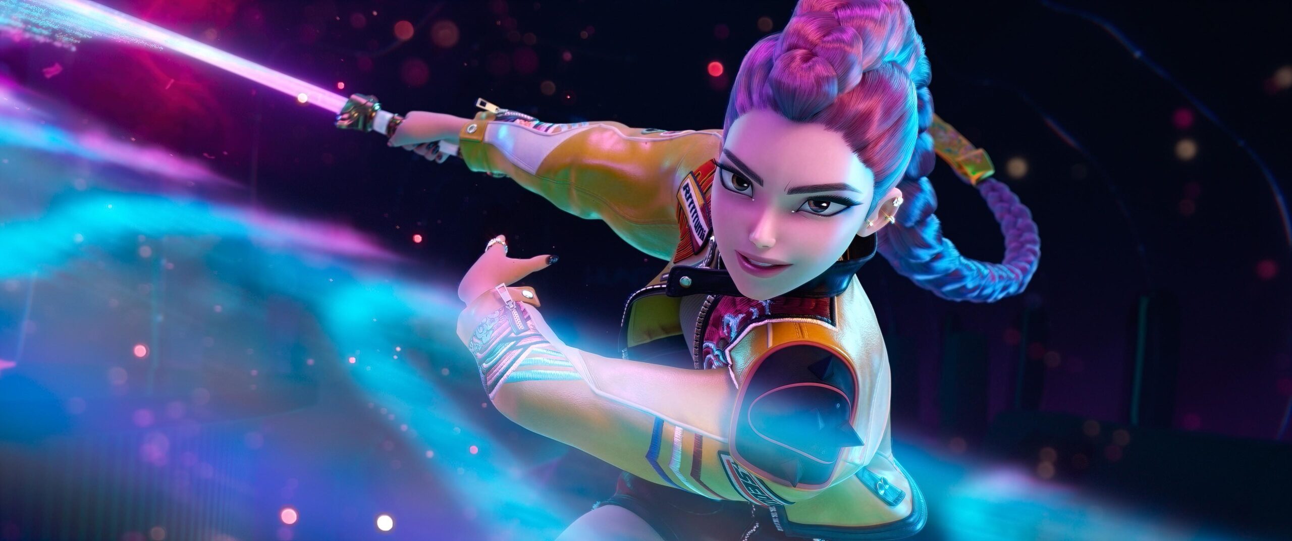
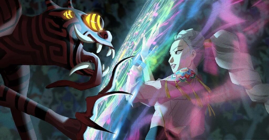
The most important color in the film isn’t actually a color at all—it’s iridescence. While gold dominates the narrative as Rumi’s goal—the Golden Honmoon that will seal the demon world away from humanity—the true visual signature is that pearlescent, shifting spectrum that includes soft pinks, blues, and greens. This iridescence represents the unified voices of the fans, the Rainbow Honmoon that surpasses Rumi’s original dream at the film’s climax. It’s woven into the girls’ clothing, visible in Rumi’s demon markings, and even present in their weapons.
Speaking of weapons, character designer Ami Thompson envisioned them as extensions of musical energy rather than traditional hard-edged blades. Rumi’s Saingeom (the “Four Tiger Sword”), Mira’s Gok-do (“Curved Moon Sword”), and Zoey’s Shin-kal (“Spirit Blades”) all feature flowing, liquid-light aesthetics inspired by cymatics—the science of visualizing audio frequencies.
Character designer Euni Cho translated this concept into iridescent blades that trail visualized music bars, creating weapons that represent “a natural fusion of performance and spiritual power.”
The Saja Boys, the demon boy band antagonists, get their own distinct palette—bubblegum pastels that contrast with the darker, more dangerous aspects of their nature. Their outfits are trendy and aspirational, the perfect trap for fans who don’t realize they’re literally being consumed by their idols. The magenta-pink of demon fire creates visual continuity between the hunters and the hunted, suggesting that both sides draw from the same supernatural source.
Chen’s approach to the color palette reflects deep research into Korean art history. Rather than borrowing obvious visual signifiers, she absorbed the underlying principles of Korean aesthetic tradition—specifically the use of color to convey emotional nuance rather than literal representation. The result is a film that feels authentically Korean without resorting to tourist-level imagery.
The Honmoon colors serve as visual breadcrumbs throughout the narrative. What begins as Rumi’s singular golden goal gradually expands to include the full spectrum of her bandmates’ contributions. The Rainbow Honmoon that ultimately defeats the demons isn’t just a power upgrade; it’s a visual representation of the film’s central theme: that true strength comes from unity, diversity, and the combining of different voices into something greater than any individual could achieve alone.
This attention to color extends to the smallest details. The girls’ hair—particularly Mira’s distinctive shade that finally gets a name in the production notes—functions as character development. Their costumes shift subtly to reflect emotional states. Even the Seoul cityscape pulses with neon that complements rather than competes with the character animation.
KPop Demon Hunters succeeds visually because it treats color as narrative rather than decoration. Every frame advances the story through hue, saturation, and light. It’s the kind of film that rewards repeated viewing not just for plot details but for the sheer density of visual information—the Easter eggs hidden in plain sight, the foreshadowing embedded in wardrobe choices, the emotional arcs traced through chromatic shifts.
The animation team has given audiences a masterclass in visual storytelling, proving that in the right hands, color can be as expressive as dialogue, as moving as music, as memorable as character. The demons may be defeated by the Rainbow Honmoon, but viewers are conquered by the rainbow itself.
Experience the colors for yourself—stream KPop Demon Hunters on Netflix and see why it took home the Oscar for Best Animated Feature.
Also Read: Everything You Need to Know Before Tommy Shelby Returns in ‘The Immortal Man’